You’ve invested in a good mattress, gave in to blackout curtains, and started a new bedtime routine, but something’s still off. What if I told you that the problem is as subtle as your bedroom wall color? Yep. That trendy “stormy gray” you loved on Pinterest might be quietly telling your brain to stay awake and worry about emails.
The last thing your eyes see before drifting off isn’t your ceiling – it’s the colors surrounding you. Color psychology isn’t just about aesthetics; it’s rooted in real neuroscience. Shades can nudge your brain to stay alert, unwind, or even spark a mild stress response.
Once you understand how color interacts with your circadian rhythm and emotional state, you’ll see why the paint on your walls might be the most underrated sleep tool in your entire room. So before you start shopping for new pillows or that expensive night light, it might be time to grab a paint roller instead.
Let’s explore how bedroom colors influence sleep, plus the best hues that can actually help you drift off faster and wake up calmer.
Your Walls Are Talking, And Here’s What They’re Telling You
Colors do more than decorate a space; they affect your biology in ways you might not expect. When light hits your eyes, it triggers receptors in the brain that regulate your circadian rhythm, your body’s internal “clock” that regulates biological function in sync with the daily light cycle. Different wavelengths can either gently shepherd your brain toward rest or jack it up into alert mode.
Cooler tones in lighting, especially those rich in blue, boost alertness and cognitive activation, which is great during the day but problematic in the evening. A 2023 study comparing red vs. blue LED light exposure found that blue light suppressed melatonin far more strongly, while red light allowed melatonin levels to recover more quickly.
Warm hues, by contrast – think reds, ambers, soft oranges and yellows – emit longer wavelengths that are far milder on melatonin production. In guidance from the Sleep Foundation, warm colors are recommended in evening lighting because they tend to interfere less with the sleep-wake cycle than cooler or blue-rich tones
The same principle applies to your bedroom walls: warmer undertones reflect a softer, sleep-friendly environment that keeps your circadian rhythm calm instead of overstimulated. Even in daylight, these tones bounce gentler light around the room, helping your brain associate the space with comfort and wind-down rather than work mode.
The Sleep Palette: Colors That Help You Unwind (and Actually Fall Asleep)
If your bedroom could talk, what would it say: rest now or stay up and scroll? Color sends that message louder than you think. The hues below are the design world’s best-kept secrets for dialing down mental noise and coaxing your nervous system toward sleep.
Soft Blue
Blue tones are often associated with lowering heart rate, respiration, and anxiety, which are attributes you want before sleep, as supported in a recent Sage Journals study. In interior color and mood, cooler hues like blue are rated higher on “restful” and “spacious” scales. Stick to soft and muted, gray-tinged blues like dusty blue and slate blue. Avoid saturated or bright blues that risk being visually energizing instead of soothing.
Sage Green
Soft, muted sage green exudes serenity and balance, making it a favorite for rooms meant to calm the mind. Blogger Nicole Bozzani highlights its ability to shift between green and gray depending on lighting, which helps it avoid feeling too “cool” or too “warm.” Use sage with natural textures and warm wood accents to keep the tone grounded and cozy rather than sterile.
Muted Terracotta
Earthy terracotta or clay evokes grounding and warmth, anchoring your space without overstimulating. Its sunbaked undertone adds just enough depth to make a room feel lived-in and comforting, like the glow of late afternoon light. Terracotta works best as an accent wall or partial wrap rather than the whole room so it keeps its richness without becoming visually heavy.
Greige
Neutral tones like warm beige or greige act as silent supports. They don’t demand attention, which is part of their strength. Because they emit softer reflections under dim light, they don’t compete with your evening cues to wind down. Use warm undertones rather than cool grays so the room maintains a cozy glow when paired with lamps or candles at night.
Mauve
Soft shades of purple like mauve and lavender combine calm from blue undertones and warmth from pink undertones, making it well suited for evening spaces. Their historical association with relaxation is backed in color therapy circles, and design blogs tout them as sleep-friendly hues, as shown in “Colors That Calm the Mind,” a study by Cognifit. Use mauve in areas you see before bed, like your headboard wall or lamp bases, to reinforce the visual cue to unwind.
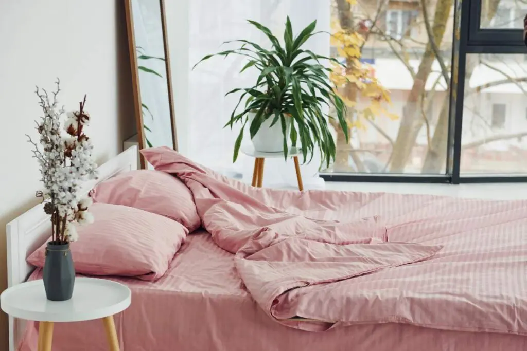
Blush
Soft, muted pinks – think blush, dusty rose, or ballet slipper – can evoke feelings of calm, warmth, and emotional safety. These shades mimic the soft glow of sunset light and can make a space feel nurturing rather than stimulating.
In fact, color psychologists from a Very Well Mind study point out that pink’s association with compassion and tenderness can help lower aggressive feelings and promote comfort, which is why certain “soothing pinks” have been used in therapy and wellness spaces.
Blush pink walls paired with cream, taupe, or light wood accents create an incredibly cozy and inviting atmosphere that feels modern, not overly feminine. Use pink in soft finishes (like matte paint, linen, or velvet) rather than glossy surfaces — this keeps the tone mellow and restful.
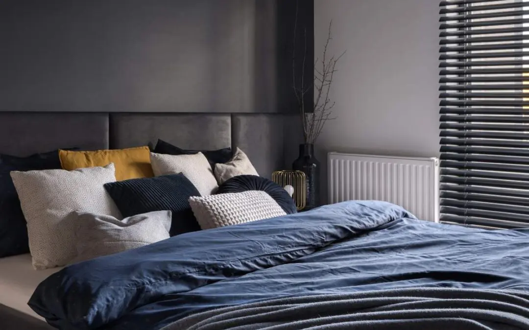
Charcoal Gray
Charcoal gray can offer deep sophistication and a cocoon-like feel, perfect for bedrooms where you want serious contrast and rest. According to Better Homes & Gardens, rich charcoal is one of the “Calm Bedroom Paint Colors That Will Soothe You to Sleep,” creating a cozy atmosphere while letting accent pieces stand out.
But beware: without enough warm lighting or lighter textiles, charcoal walls may fall flat and feel heavy, not ideal if you want to make your room feel bigger. Use charcoal just as an accent wall, pair it with warm wood tones or soft throws, and make sure your bedroom lighting casts soft upward glows to avoid that cave-in effect.
Mocha Mousse
Mocha Mousse, Pantone’s 2025 Color of the Year, is a warm, earthy brown tone wrapped in comforting richness that many designers are calling “soothing elegance.” It reflects light gently and harmonizes with natural textures, giving your space that “nestled in comfort” vibe.
Use Mocha Mousse on large wall surfaces for warmth, but offset with lighter bedding or linens so the room still breathes; it’s especially powerful when paired with muted greens or creams to lift it slightly.
Paint Your Way to Comfort and Relaxation
Color might seem like a small detail, but it’s one of the most powerful cues your brain responds to every night . The right palette creates an environment that works with your body’s rhythm. Whether you lean toward soft neutrals or warm earth tones, think of your walls as part of your wind-down ritual.